
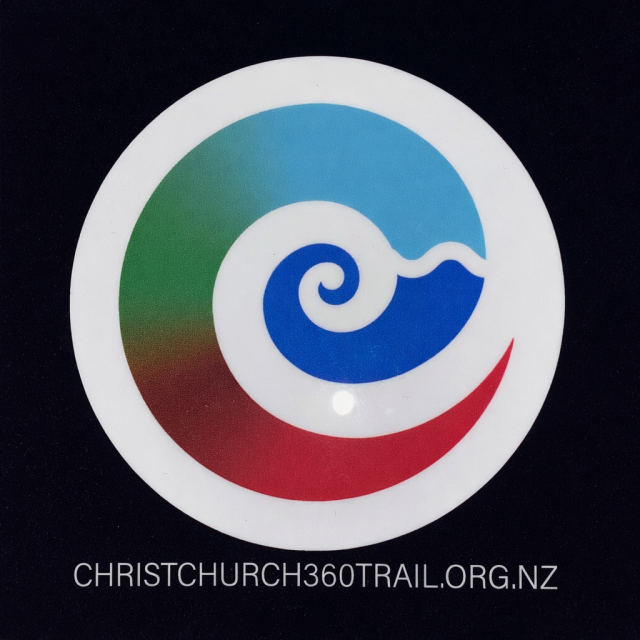
The Christchurch 360 Trail full colour logo is based on a spiral shape which is strongly connected to a traditional Māori motif called the koru.
The koru is inspired by the unfurling frond of a native New Zealand fern (especially the silver fern). Its spiral form carries deep symbolic meaning in Māori culture:
- New beginnings – like a fern frond opening
- Growth and renewal – constant development and life cycles
- Harmony and balance – the smooth, continuous curve
- Connection – between past, present, and future
The Christchurch 360 Trail design blends the koru spiral with a wave-like form, which adds another layer of meaning:
- Water / ocean (moana) – important in Māori identity and geography
- Journey and movement – fitting for something like a trail or pathway
- Life force (mauri) – flowing energy
Finally our koru-inspired design can also communicate
- A sense of place (Aotearoa/New Zealand)
- Respect for Māori heritage
- Ideas of exploration, connection, and renewal
The colours in the full colour logo also have significant meanings.
Travelling from the centre of the Kori shape outwards:

Blue (center + right side)
- Represents the rivers, ponds and lakes encountered on the trail / and also the harbours and ocean (moana)
- Symbolizes life, movement, and journey
- The wave-like curl strongly ties to coastal identity—very fitting for the Christchurch 360 trail
Light blue
- Represents the sky (rangi)
- Suggests openness, clarity, and fresh air
- Creates a sense of upward movement and freedom

Green (left side)
- Represents land (whenua) and native bush
- Associated with growth, nature, and renewal
- Connects directly to the koru’s origin (the unfurling fern)

Brown (left side)
In Māori-inspired design, brown typically represents:
- Earth / soil (whenua) – the literal ground beneath you
- Connection to ancestry (tūpuna) – land is deeply tied to genealogy and identity
- Stability and grounding – a sense of being rooted and anchored
- Pathways / tracks – especially relevant for a the Christchurch 369 trail, suggesting the physical terrain you walk on.

Red (bottom tip)
- In Māori contexts, red can represent life force (mauri) and importance or prestige
- Grounds the design—like energy or vitality at the base of the journey

White (outer circle)
- Symbolizes purity, balance, and unity
- Acts as a boundary holding all elements together—like harmony between land, sea, and sky
If you look at it this way, the full colour logo isn’t just decorative—it’s almost a map of relationships between nature, movement, and identity found along the trail and within Ōtautahi (Christchurch), Aotearoa.
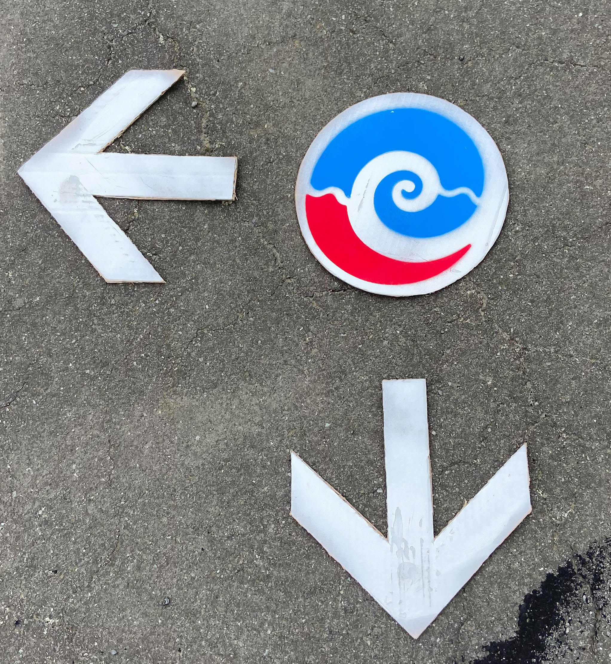
The “pavement signage” is only an approximation of the rich and meaningful full colour logo and uses just three colours – blue, red and white due to the limited pallet of road marking spray paint colours on the market.